top of page
Description
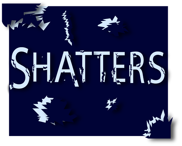
For the word “shatters,” I created a custom type treatment in InDesign designed to look as if the letters were breaking apart. I used the Pen Tool to draw sharp, fractured shapes that give the text a realistic shattered effect, layering the pieces to add depth and movement. To enhance the overall impact, I applied a subtle drop shadow, which helps the broken fragments stand out and creates a more dramatic, dimensional look.
bottom of page